Hackney Bridge
Branding for a new cultural space in Hackney Wick.

Hackney Bridge is the latest project by Make Shift; an organisation that provides space for local enterprises.
We helped to create a distinctive visual identity that reflects their brand idea to ‘champion individuality’ and encapsulates their purpose to promote independent businesses and help local communities to thrive.

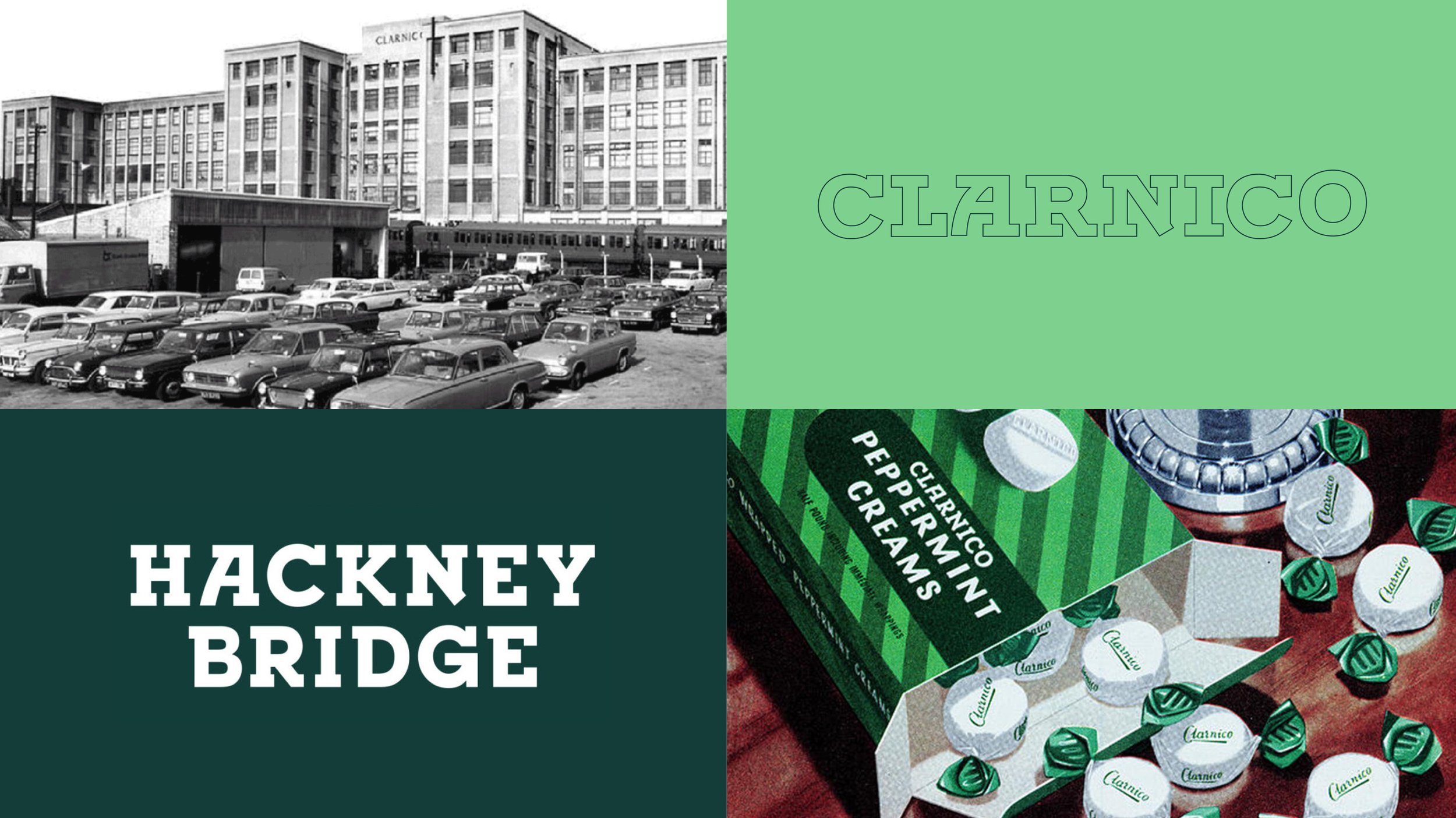
Community consultation identified a strong emotional attachment to the old Clarnico sweet factory that used to exist on the same site and provided employment for many locals up until it closed in the 1970’s. We created a visual identity that pays homage to the past – taking inspiration from the original letterforms used by the Clarnico company to design a unique new wordmark and borrowing the vibrant green from the famous Clarnico mint creams for our primary brand colours.

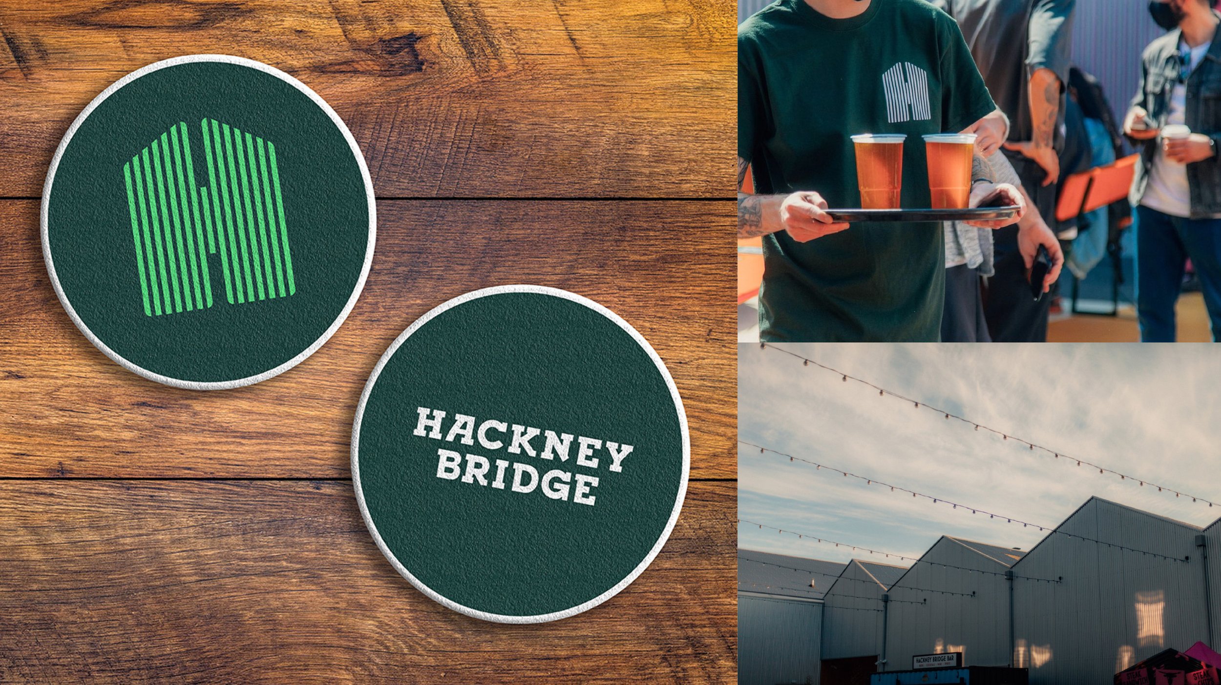
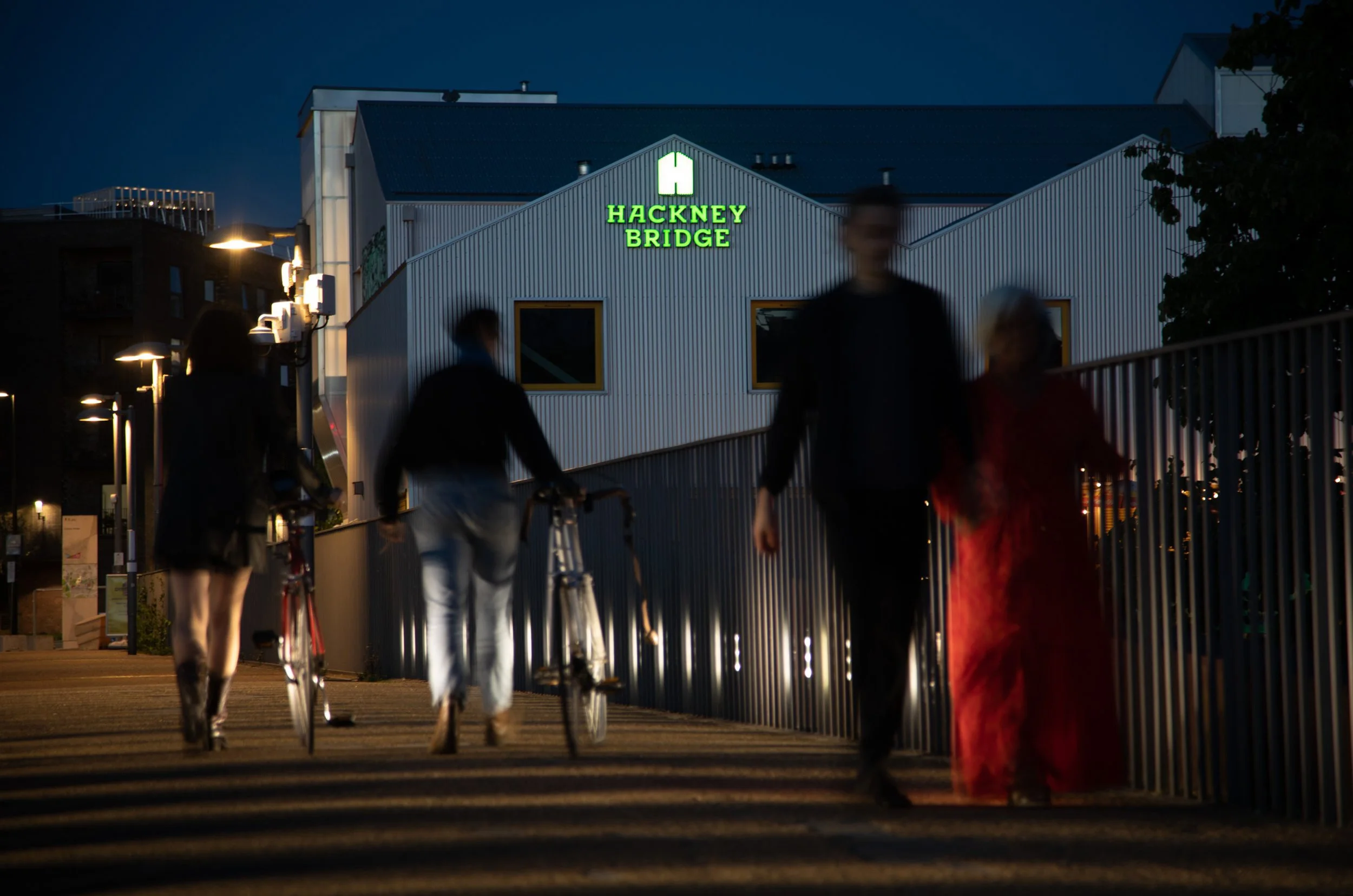
Drawing inspiration from the distinctive corrugated iron arched roofs of Hackney Bridge, we devised a unique ‘H’ symbol to accompany the word mark.

Both the ‘H’ symbol and the Hackney Bridge word mark can work independantly and locals were encouraged to remix and rework the logo to make it their own.
As well as being a recognisable symbol for the destination brand, the ‘H’ symbol can be used as a graphic device to hold images and, in particular, to showcase the independant businesses based at Hackney Bridge.


Following the creation of our symbol, we created a series of ‘roof’ graphic devices that reflect the structures on site and allow the brand to highlight and showcase the businesses and events inside.
We brought the concept to life through an interactive website design and vibrant OOH ads.


CREDITS
Creative Director: Pete Snell
Senior Designer: Louis Cochrane